
This is how a simple image in the Feature Top would look like.
That´s an alternative to the background-image of Feature Top and will be responsiv (adapt its height also).
Pro: Adapts to screensize while keeping its ratio, so takes up less space than a background pic with text on it probably.
Con: More complicated to get text placed on it. Will adapt until it reaches maximum (original) width, then (on larger screens) background will show up left and right.
Hint: Use the code the editor produces to insert an image in original size without a link somewhere on a test page. Refresh that page and inspect your source code to find that image. WordPress automatically includes responsive images in a few different sizes. When you copy that code from your source, you can save loading time on mobiles because smaller image sizes will be used there.
The code will look something like this: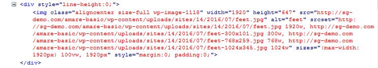
Copy that code. Use a textwidget, drag it in the Feature Top widget and paste the code in there. To avoid unwanted gaps around the image, I wrapped it in a div and added inline styles to the pic itself (style=”margin:0; padding:0;” – you can see that in the pic also).
Use a large image, but low in height. My original pics are 1920px wide. Important: Optimize before you upload or use a plugin that optimizes your pics while uploading, else your sites might load slow and large images might show up late. Without a plugin, visit this site to optimize large pics: https://tinypng.com/
